
How to match a paint color from a photo
By Burak. Updated 7 November 2026. About
Take the photo in daylight, fill the frame with the surface and include something white. Tap a flat, evenly lit spot away from shadows and shine, then compare the closest colors by ΔE: under 2 is hard to tell apart on a wall, under 4 is close. Treat the result as a shortlist and confirm it with a physical sample on the wall.
What a photo can and cannot tell you
A photo records the light coming off the paint. The number the camera stores for a pixel depends on the paint, but also on the light falling on it, the camera's automatic white balance and exposure, and the screen you view it on. A matcher reads that number and finds the paint whose published color is closest to it.
That makes a photo good at narrowing thousands of colors down to a handful, and bad at telling two near-identical whites apart. The steps below keep the camera's guesswork small enough that the shortlist is right, and the last step, a sample on the wall, makes the final call.
Take a photo the matcher can read
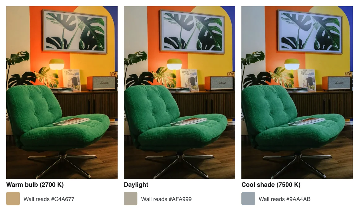
- Shoot in daylight from a window, not under a ceiling bulb. A warm bulb at 2700 K pushes every color toward orange.
- Turn the flash off. It adds a hot spot and changes the color of everything close to it.
- Stand square to the surface and fill most of the frame with it, so the camera exposes for the color you care about.
- Put a sheet of white printer paper in the shot, touching the surface. It shows how far the camera moved the colors.
- If your phone has a manual or pro mode, lock white balance to daylight (about 5500 K) before you shoot.
Pick the right spot
Tap a flat part of the surface that is neither in shadow nor catching light. The tool averages a 5 by 5 pixel area under the loupe, which smooths out grain and noise but not a shadow or a reflection.
Textured walls, fabric and wood have many colors at once. Try three or four spots and look at what stays the same in the results: the brand colors that appear every time are your real candidates.
- Avoid corners, where two walls bounce light into each other.
- Avoid the area right next to a window, which is often overexposed.
- On fabric, pick the main body of the weave, not a highlight on a fold.
- On tiles, pick the glaze, not the grout.
Read the match
Each result shows a ΔE2000 value, the international standard measure (CIE 2001) of how different two colors look to a person. It is calculated in CIELAB, a color space built so that equal distances look roughly equally different.
| ΔE2000 | What it means on a wall | What to do |
|---|---|---|
| Under 1 | Indistinguishable for most people | Order a sample to confirm sheen |
| 1 to 2 | Very close; hard to tell apart on a wall | A safe first choice |
| 2 to 4 | Close; visible side by side, not across a room | Sample two or three |
| 4 to 6 | Similar; can stand in for the color | Compare samples carefully |
| Over 6 | A different color | Try another spot or photo |
The closest paint from another brand is often within 2. When several brands come back within 1 or 2 of each other, you are looking at a popular color that most makers stock, and any of them will do.
Matching an existing wall at the store
A decorator shows where to cut a small painted sample from a wall and how a paint store's computer reads its exact color. Use that method for touch-ups, and a photo when you are choosing a new color.
Why a photo is never the last word
Even a perfect photo stops at the screen. Paint also changes with sheen: the same color looks a little darker and richer in matte than in eggshell or satin, because matte scatters light. And a color looks lighter on four walls than on a small chip, because the walls light each other.
Use the photo to narrow the choice to two or three colors, then put large samples on the wall, at least A4 size, and look at them in the morning, at midday and in the evening. Check them next to the floor, the trim and anything that stays in the room.
When to skip the photo
- Touching up an existing wall: take a chip of the old paint to a store with a spectrophotometer. It reads the paint itself.
- Matching a brand color for print: use the brand's Pantone or CMYK values instead of a photo of the logo.
- Very dark or very saturated colors: cameras clip them, so the reading drifts more than with mid tones.
Questions
Can I match a paint color from a photo on my phone?
Yes. Open the photo in the color identifier, tap a flat, evenly lit spot and read the closest paints with their ΔE. A phone photo is good for a shortlist of two or three colors; confirm the final choice with a sample on the wall.
Why does the matched paint look different on my wall?
The photo was taken under different light, the camera adjusted white balance, and a large wall reflects light onto itself. Sheen changes the look too. Compare samples at different times of day before you buy.
What ΔE is good enough?
Under 2 is hard to tell apart on a wall, under 4 is close enough that most people will not notice across a room. Above 6 you are looking at a different color.
Is a store scan better than a photo?
For touching up an existing wall, yes. A store spectrophotometer reads the paint itself, without the camera and the light in between. Take a chip about the size of a coin.